A running rant about bad television, crappy products, horrible service, mindless politics, corporate and government ineptitude, moronic media, marketing overload, public idiocy, stupid entertainment, etc. Here's what's annoying me today:

11.07.2006

Gee, that's big of you, Quark


Just got this email from Quark, the page layout program that I ceremoniously dumped about a year ago. I no longer use the program, except for the occasional update to an old job that I haven't felt like converting to InDesign. Quark just came out with a new version that I have no intention of buying, and know next to nothing about. The email stated with great excitement, Important licensing change: Upgrade to QuarkXPress 7 and continue to run QuarkXPress 6. Yes, it’s true. Your license for QuarkXPress 6 remains alive and well when you upgrade to QuarkXPress 7

Well, what the fuck, Quark. You mean that before this big announcement you were actually forcing people to disable the old version that they had payed $1000 for? When anybody who has ever used Quark knows that any new version will be so full of bugs that they will end up reverting to the old version for the two years it takes Quark to fix all the problems anyways?

That's the bullshit that has caused everybody to abandon this company in droves. The fact that you set up the new release like that in the first place, and now consider it a big gift to your customers to let them keep using the old version shows that nothing has changed in Quarkland.

I'm very happy to be through with you.

[computers] [graphic design] [products] [publishing]

Labels: , , ,

4.13.2006

Stop coloring your email


I hate colored email. I'm not talking about HTML email from businesses (that is covered under spam). I'm talking about the kind from your Aunt Betty, who knows nothing about computers, and certainly nothing about graphic design, but still can figure out how to change the text of an email to green, and the background to some awful flower image. She can also choose the tackiest true type font (say Mistral) and put the whole letter in that for good measure.

Just stop it.

Emails should just be typed in one basic font. No crazy colors or fonts, or fucking italics. I know of no graphic designers who design the type in their emails. Get yourself a blog for your cat, and then you can use all the tacky fonts, ugly clip art, and silly background images you want and the other cat lovers will think they are great.

OK, now I've offended all cat people.

Labels: , ,

3.14.2006

My clients are driving me crazy today

Note to client with attached image: They may not have the frame we wanted in the right resolution. They are checking. This is an alternate shot that they do have. Do you like this shot OK?

Client: Can we use this photo larger? I am not happy with the size it is in this e-mail. Really doesn't give you a bang for the buck. What if I find a photo in a gardening book. Can you scan and use with credit to book? Call the publisher for permission?

Client friendly note I sent back: Yes, it will be a full page like on the previous comp. That's as big as I have it right now. Just for you to see the image.

Note I wish I could send back: You moron. How long have you been doing this job? This is a low res version in an email for you to approve the fucking photo of the pretty flower. Do you like the pretty flower photo, or do you hate the pretty flower photo? That's all I'm asking. I have to buy the photo in the right size, once you tell me its OK. Of course its going to be bigger than this. Do you want me to email you the 35 megabyte file, so you can see? How come you didn't ask me if it was going to have words across it in the magazine. And no, I'm not scanning a photo out of your fucking gardening book.

This is why my blog is semi-anonymous

Labels:

3.12.2006

Blogs that look like mine


So I think it's about time I learned how to design an original blog template. Anybody who looks at many blogs has probably seen at least a few dozen that look like mine (minus the thumb, which I managed to modify).

This is especially true since my blog was featured a couple weeks ago on Designers Who Blog, and I still have many visitors who come from there. I probably don't have too much credibility with the design community when my blog design is just a stock Blogger template— albeit a pretty well designed one.

It's very much like stock photography. I try to discourage my own print design clients from using royalty-free stock art for just this reason. The image that they cheap out on to represent their happy and satisfied customers, could easily end up in a competitor's ad to represent their happy and satisfied customers. Or worse yet, end up in a porn site or some other embarrassing place.

On that note, as I was searching for an entertaining example to use as the image for this post, it suddenly became much funnier. My first random hit on a site in Blogger that looked like mine was the above hard-core gay porn blog.

My only excuse, fellow designers, is that as a print designer, my web design skills are limited. I know it's probably not rocket science, but I just don't technically know where to begin to design my own template yet. I'll figure it out someday, but blogging alone is very much distracting me from my paying work, so you'll just have to bear with this cheap stock template for a while longer.

Labels: , , ,

2.23.2006

Shit work I've done for cash

As requested, another post about my day job.

I could fill a whole blog with crappy shit that I've been forced to do by clients or bosses during my life as a designer: having to use crappy photos for political or budget reasons; having some senior marketing dufus come up with a "brilliant" idea that he forces me to do, that is really the most idiotic thing I've ever heard in my life; clients who say they want something "edgy" but are terrified of doing anything they haven't seen before. On and on and on.

Every day, the life of a designer is filled with compromises. Usually I grumble a bit, argue why some other solution would be better, and then "do what the client wants," while trying to save the thing as much as possible from completely sucking. I can generally live with the results, even if most of the shit I do these days isn't award-winning. It pays the bills. As a former creative director used to say. "If 5% of the work you are doing is cool, then you are doing OK" Basically I feel that most of the cool work I've done is stuff I've managed to sneak by when somebody wasn't paying attention.

So looking back over the past year to find the worst example of shit I've done for money, there was one particularly horrifying job I worked on (for a client I would never work for again, so I could care less if they see this). It was during a slow period last fall that I agreed to be an interim art director for a couple weeks at a local business magazine.

INSIDE BASEBALL WARNING

Turns out it was one of these "all-advertorial" magazines. For those of you not in the business, "advertorials" are those little sections in the middle of "real" magazines that are really ads designed to look like a special editorial section of the magazine. They are totally bogus, but like stadium naming rights, are here to stay. Most legitimate magazines label them in very small type at the top "special advertising section"

But there is a particularly awful new breed of magazine where every article in it is bought, written by, approved by, art supplied for free by, or somehow else completely controlled by the company the story is about. To the average dope, they may look like a real magazine, but to anybody with a brain in their head, the real purpose is pretty obvious. In general these rags are horrible looking.

They are sort of the bastard stepchild of custom publishing, a slightly more legitimate branch of marketing where businesses will publish a marketing brochure disguised as a magazine. Starbucks had one for a while that was pretty cool looking. While those are still pretty dubious as far as having a legitimate editorial mission, at least they are professionally designed and produced for the most part.


So anyway, the above is a spread from the issue of this rag that I worked on. The red circles point out all the reasons why to someone who loves magazine design, this was such a stench-inducing job to work on.
  • 1: Every feature in the entire 120 page magazine must follow this exact grid

  • 2: Story is a 100% puff piece bought by the subject company, and either written by, edited by, or approved by the company it is about

  • 3: Cheesy use of "vignettes" is required in all features

  • 4: For some stupid reason there is a full line space after each paragraph, which looks ridiculous

  • 5a: Every piece of art in the entire magazine is either supplied free by the client (aka, the subject of the story) or royalty free stock art. The art budget is $0. Note first use on the page of businessmen-shaking-hand partnership cliche photograph.

  • 5b: Hard to make out, but there is a second businessmen-shaking-hand cliche in this cheeseball section icon, which is repeated 34 times in the issue.

  • 6: Bio of the whore who wrote the story

  • Not labeled: Had to chase this client down for nearly three months to be paid

If you have made it this far, and still care about this subject, first, get a life, second, here's a link to another blog that talks about this particular magazine, and its ilk.

Labels: , , ,

2.22.2006

Come work for us (for nothing!)


As a freelance graphic designer with a pretty steady client base, I fortunately don't have to rely on the help wanted ads on Craigslist, Guru, and other job posting sites. Thank god!! I well remember the days of being a starving artist.

My first real job was is the art department of a certain alternative weekly newspaper. Well, actually my first real job was making signs for a department store, but I don't like to talk about that one. I'm sure one of my regular readers will fill you in on the clown mask I used to put on when I got home from that job it made me so crazy. SickOE, please keep in mind this is a public forum.

But anyway I digress. The newspaper gig was a great job and a great relief from making signs for toaster-ovens, especially for the partying and perks that went along with it. But I made shit. I think I made $12,000 a year full time when I started. The basic philosophy of the place was "this is such a cool job, that they should be paying us to let them work here." And it certainly worked for them.

That attitude is alive and well on the job posting boards today. Why pay for a professional to design your logo, when you can find somebody to do it for $250 bucks. It's really a depressing commentary on what the perceived worth of graphic design (and other creative work) is, if the rates offered for our services on the boards are any indication. Here is a sampling of what people think creative work is worth in Boston today.

  • Magazine Seeking Artists and Writers Compensation: Selected articles will receive $20 for every submission.

  • Need Outdoor Location Photos: There is no $ budget at all for this job. What we can offer is visibility and credit/advertising on the well trafficked site

  • $100 to anyone who can paint/draw/photograph something cool.

  • Corporate Logo Needed: Compensation: Less than $250 (This appears to be the going rate for a corporate logo on Guru.com)

  • Drawings of famous philosophers needed (Nietzsche, Freud, etc.): Compensation: $30 per picture

  • I need a student or someone willing to work for free/trade to design a rock star flash site for my business: Compensation: Not sure yet, maybe some food? coffee? small stipend? a hug?

  • Seeking a design for our corporate logo, Timeline is one to two weeks, more if needed. We have already selected the colors, images and art for the logo (gee leaving a lot of creative to the "designer") Compensation: start at $160

Labels: , , ,

2.06.2006

Quark, you and I are through


This is going to be a bit of inside baseball for most general readers. Not sure how many people outside the publishing business even know what Quark XPress is. For the uninitiated, it is the software program that has been the standard bearer for producing newspapers, magazines etc., since the publishing world went desktop nearly 20 years ago. I have been essentially married to it since I started using version 1.0 back in about 1987. Do other people whose jobs center around the computer feel that way about the software program they use most? That you know it so well... know all its quirks (a favorite Quark nickname)... know what annoys you about it... how to manipulate it to make it do what you want. It really is like being married. Can't live with it, but can't live without it.

Anyway Friday, after whining (along with most other Quark users) for nearly five years and wasting half the day trying to uncover the reason for it's daily flip-out, I started to switch my largest job over to InDesign, the competing program by Adobe. It's a huge undertaking, because not only do you have to rebuild the entire job template from scratch, but you have to essentially learn a new language at the same time. InDesign, from all my experience so far does everything better, but also does everything different.

Now as to why, I have had to take this drastic step:

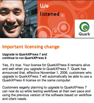
Quark Xpress, for at least the last five years has become the suckiest software program on earth, and Quark the most arrogant company. What other program regularly corrupts files beyond repair, rendering a 50 page magazine file useless. Of course anybody who used Quark with any regularity has become so paranoid that they back up files, make duplicates, copy the files to another machine about every ten minutes, just because they know that eventually Quark is going to kill the file.

Five or so years ago, Apple moved its operating system to OS X, a system that required software developers to completely rewrite their software. Every other software company whose clients worked heavily on the Mac, had their software updated within six months to a year. Quark took nearly three years to come up with a release that was compatible with OS X, forcing users to either put off upgrading their systems, and therefore upgrading any other software they owned. Or to run a completely separate system in the background, a process that led to a whole host of other problems.

When Quark finally did come up with a new version three years later, if was so full of bugs, that many people still didn't upgrade. It crashes regularly, displays things on the screen that aren't really there, and many other problems too numerous to even get into.

Quark Inc. has also behaved like the arrogant monopoly that is was. Nobody (except me) ever bought version 5.0, because it came out after OS X, but wasn't OS X compatible. So 90% of users were still using 4.0. When Quark finally did come out with a new version that was OS X compatible three years later (6.0), they purposely put a block on it, so you couldn't downsave to 4.0. Essentially they were forcing everyone to buy the upgrade for every computer they owned.

So anybody that did upgrade right away had to deal with clients that were still on 4.0, and hence, couldn't open the files. Any users with a history with Quark know not to upgrade right away, because every new version they come out with is completely riddled with bugs. So users were in this classic Catch-22. Should I upgrade first, and have my client not be able to open my files, of wait, and have the opposite problem?

Over the past year, most of the publishing industry has been switching over to InDesign. I bought it about a year ago, and have been slowly learning it, and building jobs for new clients in it for six months. It seems like a great program. It may have its own share of problems, and Adobe is an even bigger monopoly than Quark ever was. But if nothing else, I no longer live in quite the fear I always did with Quark, that if I do something it doesn't like, it's going to destroy a week's worth of work.

So goodbye Quark. You were my first software love. We had some good times together. But now its time to leave your sorry ass behind.

Labels: , , ,